
I was selected to create works on illustrator and at first, I never had experience with the adobe illustrate program before so this was a challenge for me. i was familiar with photoshop and how it was used but not ever working with vectors and paths to create posters.
To get started, I watched a youtube video on how to use the shapes and basically getting the feel of the program at first to make images and characters on illustrate. Since the colors and shapes come out flat i used shading and the shape builder to add dimension to the penguin.


Using shape builder tool:

To start with the posters, I wanted to mess around with the effects, and in the design world, have seen alot of designers use the halftone effect to add to the aesthetic of their works.
First poster
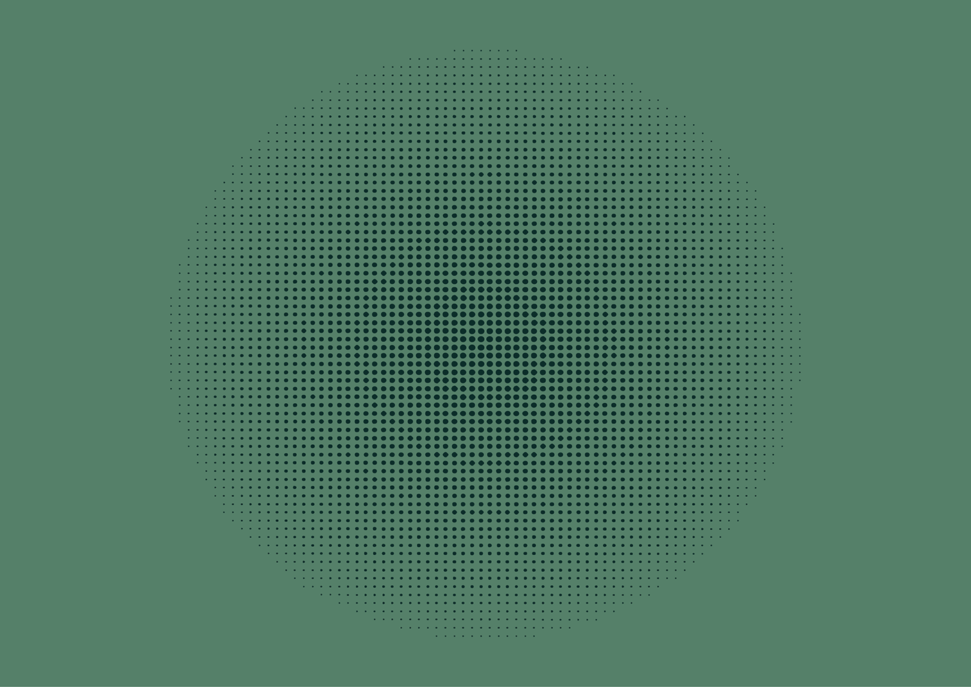
It was simple and easy to do but very minimal and not very what i wanted for my final project.
To add to using halftones. I started experimenting with typography and messing with effects to stylise the font itself.

I like how it gave the blurred effect on the font but, when i added the grain effect on top, the font did not blend with the background and kind of cuts off with it.
I like the grain effect but is not great for this purpose
I then started on the blending tool, where you can blend shapes and colors together making sleek transtions from one to another.

Nothing much to say, but still experimenting with shapes and the colors blending with one another.
I then started using pathfinder tool to create something it looks like it got cut out, by also using the drop shadow to create shadows, which also add dimention.

I wanted to find something that fits the aesthetic trends of today. so, I looked on tik tok for a tutorial. It showed me how to use the mesh tool and gradient tool to make cool shapes and used it to make this grainy colored poster.


Final poster:

I started to have fun with the gradient effect and used it to make another poster by make it a bit more minimal and without grain.


I wanted to experiment with font more and found this spiral effect using text.

Rendered version:

This one was more tedious and harder than the other tutorials I found and glad I could achieve the effect I wanted.
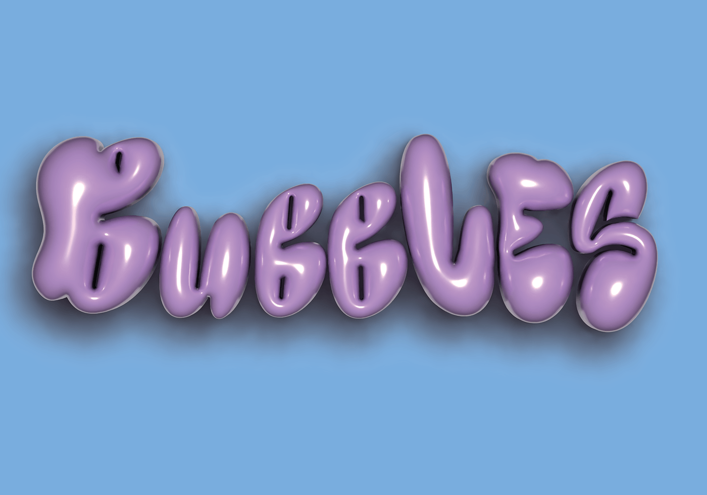
My favourite one was the 3D effects on illustrate which i found and created this bubble effect on the font I download watching its tutorial.
Another effect I discovered was using the blend tool to create 3D objects to make shapes using pathways. This one reminds of a piping tool by how its shaped.

It was an interesting way of making shapes, this is my poster of it.

Though it is 3D, the shape isnt completely smooth as the blend steps options only could create so many shapes at once.
Using the blending tools again, I found a way to warp text using the pencil tools and blending it together created a 3D effect and cool angle of perspective.

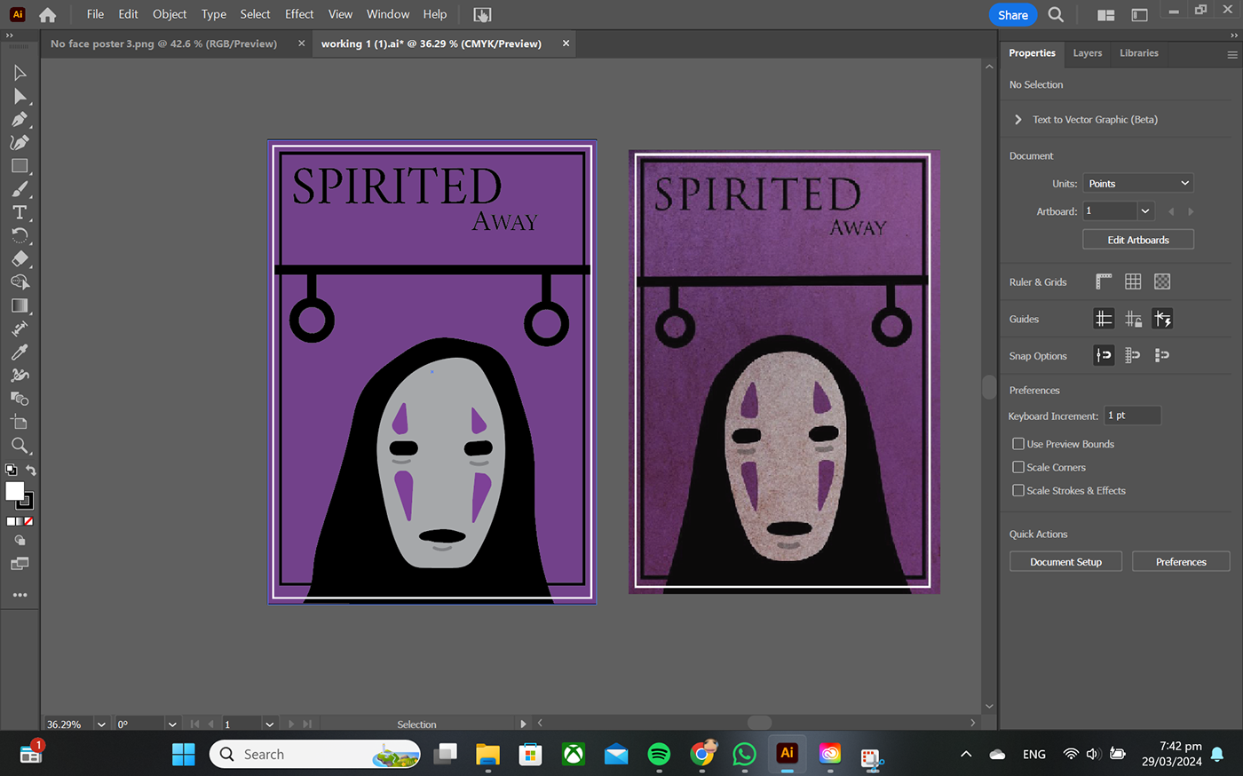
To start with my movie posters, i started simple by replcating shapes and simply illustrating what i saw from the referenced photo
The reference and my poster I made (blue one)


First mock up of second movie poster:

Rendered:

First Mock-up of third poster:
Rendering:


Everything was made through references and I kept elements of those posters but have rearanged the composition of the last two and the first one,changed the colors.
To brainstorm for my final poster to make for a movie, I looked on pinterest for inspiration and a theme.
My favourite movie as a kid was the movie Coraline, it was easy to conceptualise as i have seen it many times and created a moodboard for it.
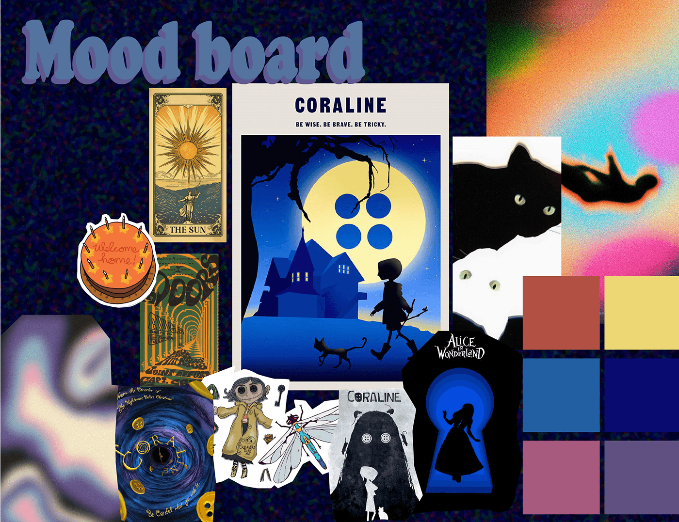
Not knowing where to start, I was think at first for my poster to have a tarot card look to it.
I realised that this didnt work for the concept i wanted and that my colors at first were too dark to visually comprehend.

I decided to change the whole composition and go a different look, ending up with this.
What I came up with:

I had alot of fun with this experiment, but still have alot to learn skillwise and having enough to meet my expectations.
for my last poster, I would next time add more dimenstions to it as it is too flat for my liking and change the instensity of the grain effect on the poster as it takes away from the subject of poster. I overall like the composition of the poster and the style of it too.


